10 Steps for Mobile-Friendly Website Development

MarsDevs is a one-stop development shop! Our experienced and dedicated developers empower businesses and tech needs with outstanding code quality and excellent UIs. From ideation to development, deployment to management, we chip in anytime enterprises need. Ready to stand stronger with you, our tools include: - Python - Nodejs - Vuejs - Reactjs - Angular/Angularjs - React-Native - Flutter - AWS - GCP and more Each of them is chosen to create more efficient solutions faster. We believe in innovation and lead with consistent effort, dedication and flexibility. MarsDevs also provide Digital Marketing services like - Search Engine Optimization, Social Media Marketing, and Search Engine Marketing.
Google has been moving its focus to mobile search in recent years. Currently, 70% of the entire web is on the mobile-first index. The SEO section depicts that Googlebot indexes your website's mobile version instead of the desktop one. As a result, if your site isn't mobile-friendly, it's unlikely to rank high in search results, and worse, your rankings may drop abruptly.
That means Tomi T. Ahonen was 100% accurate when he said, “Mobile is the enabling centerpiece of digital convergence. Mobile is the gel for every digital industry while seeking confluence. Still, it’s the digital pathway for the real world to collaborate in this global metamorphosis of the human race.”
So, how do you create a mobile-friendly website for your users & turn Google crawlers adore it? Let’s discover together!
Here we will discuss:
But first, what are mobile websites?
Ways to make your website Mobile-Friendly
10 Steps to make a mobile-friendly website
● Test the website on mobile devices
● Maintain a Readable Font Size and Color
Why is a mobile-friendly website so important?
But first, what are mobile websites?
Mobile websites have been specifically developed for mobile devices such as smartphones and tablets. These sites typically feature a simpler style and layout, making them simple to explore and utilize on a smaller screen.
A website optimized for mobile devices is considerably superior to a website that needs to be mobile-friendly. It’s because mobile-friendly websites give a better user experience, which can result in higher engagement and conversion levels.
In a world where more and more people use the internet via mobile devices, it is critical for businesses like yours to not only have an online presence but also to design sites that operate well on these smaller displays.
Take Apple, for example. They have made it their objective to build a mobile website that allows people to research more about their products conveniently. Most of their sites with sections have a simple yet ordered visual pattern consisting of a header, subheader, and image. This simplicity allows the dynamic product photographs to take priority, drawing you into their streamlined design.
Ways to make your website Mobile-Friendly
When we talk about a "mobile-friendly" website, we mean it displays a different 'version' of your website to mobile visitors to provide a better experience. So, how can you achieve this? There are mainly 3 ways:
Using responsive design
It means that your website's structure adapts to the screen position, whether you are modifying the desktop tab size or browsing from a mobile/tablet.
Using dynamic serving
Dynamic serving entails showing users a distinct, purpose-built site version based on their device.
A mobile app
Having a fully separate app for your mobile users makes the most sense in certain circumstances. However, that also means updating your website for those who don’t want a mobile version of your website.
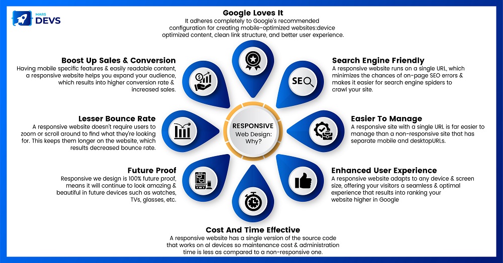
Responsive design is the bare minimum you should aim for, and it's what Google suggests & one of the essential pathways you can take to make your website easier to use.
10 Steps to make a mobile-friendly website

Now that we have cleared what a mobile website means and why you need it, it’s time to make one. Here, we break it down into 10 simple steps for you!
Choose a Responsive Layout
As Josh Wilson puts it, “Responsive Website Design always plays a vital role whenever promoting your website.” A responsive layout enables a website to resize itself based on the device to view. It allows the website to adjust to multiple screen widths without experiencing any rendering difficulties.
Because the website adapts to the device, responsive web design works well for mobile and desktop platforms. A mobile-responsive website increases a website's SEO value because Google likes crawling and ranking mobile-friendly web pages. Incorporating a flexible style helps websites rank higher in Google searches.
Optimize Website Speed
The first impression of any website is set by its speed. If a website takes more than 2 seconds to load, 47% of visitors will quit it, while even a 1-second delay in page response can reduce conversion rates by 7%. Because Google considers website speed a favorable ranking factor, web developers must take all necessary steps to improve website speed.
Compress Images
Making your website as light as possible is always a good idea, but what does it entail? It means making sure that the images are mobile-friendly. It entails lowering file size and utilizing images appropriate for the screen size. Image optimization helps elevate the page speed of your site. Websites that load quicker proved to have an amazing user experience.
Avoid Pop-ups
If used correctly, pop-ups can be very effective on a site's desktop version. You may have noticed that they appear on several pages of WBE. But when it comes to mobile, Pop-ups are a big NO! Not only do you have a smaller display to deal with, but you also can't customize the pop-up to appear at specific times, such as when the user is about to quit your screen.
Test the Website on Mobile Devices
Testing your website on real mobile devices is an efficient technique to ensure that it provides an optimal user experience. Real-world testing allows for discovering and resolving any issues or discrepancies a user may encounter in real-world situations.
Run every user scenario on as many genuine browser-device-OS combinations as possible so customers can easily surf, regardless of their mobile device.
Maintain a Readable Font Size and Color
Jared Spool said, “Intuitive design is how we offer the user the latest superpowers.” Because intuitive design places your customers as 1st priority.
While it's often advised to use a font size of at least 14px on a desktop, ensure you test it out on your mobile version - chances are it'll look a little small & you'll need to increase it a little. But that's not enough. Ensure that you check your font's readability as well.
It's one thing to experiment with a more experimental typeface on a desktop, but this strategy is unlikely to pay off on mobile. When working on a mobile version of your site, you have a far smaller area to deal with. Text can be spaced out on a desktop with line breaks and graphics.
To prevent text from melting into one another on mobile, try bolding or capitalizing individual lines of text. Take Forbes, for example. Forbes uses large print with enough space to make their posts stand out and easily read on mobile.
Make a Simple Layout
“Simplicity is the ultimate form of sophistication.“ It’s one thing that you must follow rigorously on your site.
You must ensure you are not clogging the website by giving all features on the same page. It must be clarified, making it harder for visitors to navigate a website with too many items. Provide only the key functions upfront because those are the ones people will actively seek.
Prioritize a tidy, simple style that makes navigating intuitive for a smooth user experience. On a website, developers can add one of the essential aspects of current web design - the Hamburger button. Mobile users can open the complete menu with a single click if implemented. It improves navigation and creates a more visually appealing web layout.
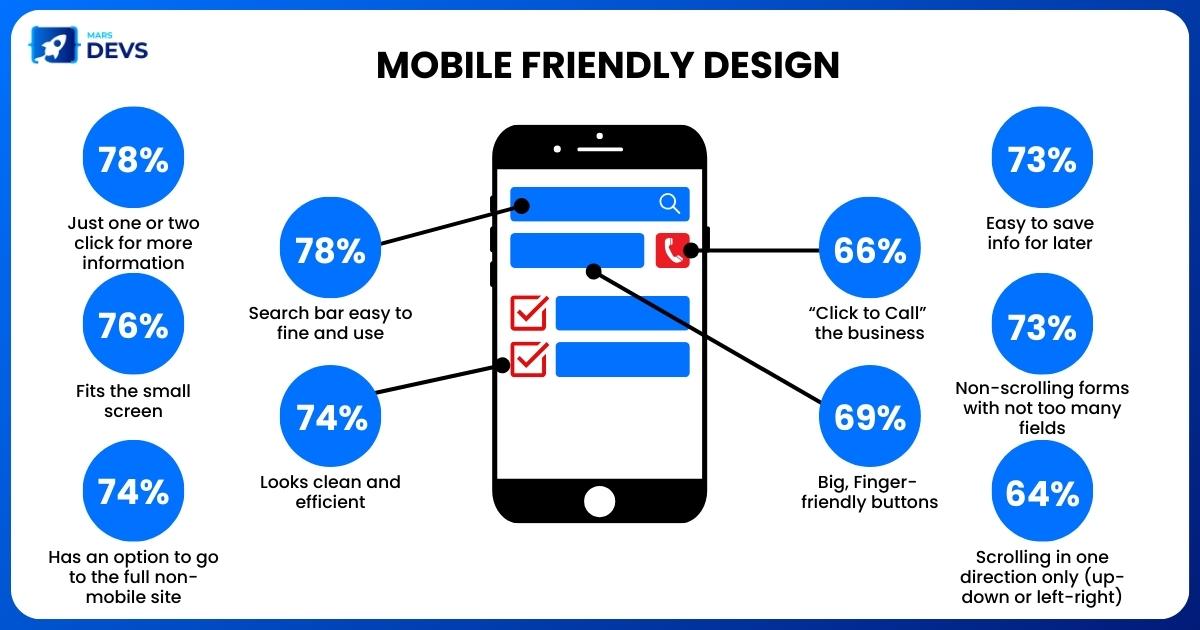
Add Search Bar
Mobile screens are significantly smaller than desktop screens. As a result, finding exact details can be challenging. Adding a search function on your website can help people discover the information they need quickly & improve the general usability of your site.
However, how you design the search bar depends on what you want your users to focus on. For example, news websites often use a simple menu bar sign. On the other hand, E-commerce websites often have a larger search bar at the top of the homepage & higher contrast to make it easier to find.
Add Responsive Forms
When forms on mobile devices aren't optimized, they can be difficult to fill out. It frequently results in frustration and failure to accomplish. It may be disastrous for many firms, as valuable actions such as contact forms, lead generation forms, and even checkout pages are abandoned.
Here are some tips for making responsive forms:
Reduce the number of fields (if it isn't necessary, remove it).
To help speed up the operations, use input masks and auto-fill options.
Provide clear error messages and validation feedback to assist users in determining where they went wrong and where they entered the information correctly.
Test Your Design
The simplest way to determine the mobile-friendly features of your website is by testing it! You can meet this in 3 different methods:
- Running URLs via Google’s Mobile-friendly Tool
Google offers a free mobile-friendly testing device & everyone can know the mobile-friendliness of various URLs - whether a homepage or a page within your site.
- Try Out Different Devices
Playing around with the form of the tab of your website that you have open is a terrific approach to testing how responsive your site is. As you eliminate the tab width, you may notice your website to 'contract' & become more mobile-friendly.
- Using “Inspect”
To rapidly assess the appearance of anything on mobile, right-click on your webpage, pick 'Inspect,' and then click on the symbol of two screens in the toolbar across the top.
Why is a mobile-friendly website so important?
As Cyndie Shaffstall says*, “Mobile is not the future. It’s present right here. Meet your users in the environment of their choice, not where it is convenient for you.”* A mobile-friendly website ensures that your website visitors get the best user experience possible regardless of the device they use to view it.
Furthermore, if your website is mobile-friendly, Google will rank it higher on its SERP, potentially resulting in significant visitor loss. Customers are more likely to return to mobile-friendly websites that provide responsive, smooth, and enjoyable buying experiences.
Consumers are more likely to spend more time on your website and tell their friends and family about your brand if it’s convenient to use on a mobile device and make further purchases. A mobile-friendly website can help businesses reach more people and generate more leads and revenues. For customers, it can provide a better experience!
In conclusion
Creating a mobile-friendly website is crucial, but the mobile-optimized website should give a perfect user experience across each device-browser-OS combination. Mobile devices have substantially altered how individuals access the internet daily. This trend is expected to continue as more individuals access the internet primarily through mobile devices each year.
Also, since prominent search engines such as Google strive to make the web a mobile-first search landscape, having a mobile-friendly website must come before developers and testers. So, just stick to these steps to create a better, more user-friendly, mobile-friendly website. And if you need to build one from scratch - reach out to MarsDevs!


